Seeing Engineering Differently: The Brand Design Behind Aptive Engineering
- Darren Hart

- Apr 17, 2025
- 2 min read

At 3 Clouds Collective, we believe that a great brand is more than just a logo — it’s a visual language that tells a story. When Leif and Yolanda Bradbrook of Aptive Engineering approached us for a new identity, they brought a clear vision: a brand that reflects their precision, adaptability, and forward-thinking mindset. The result is a distinctive and meaningful logo that speaks directly to who they are and how they work.
Custom Typography with Purpose
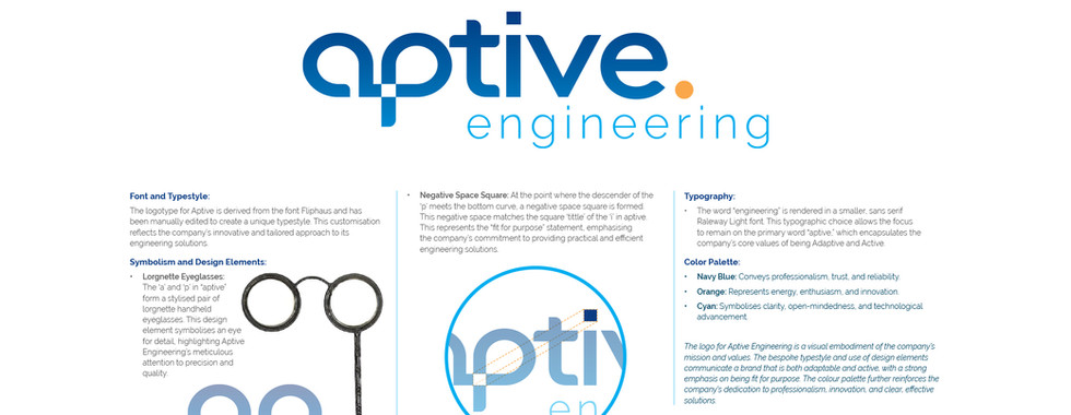
The logotype for Aptive began its journey with a run-of-the-mill rounded sans serif font. But we didn’t stop there. Through careful manual editing, we transformed the type into something unique — a one-of-a-kind typestyle that mirrors Aptive’s tailored approach to engineering solutions. Just as Aptive customises their work for each challenge, we customised their word-mark to stand out with intention and originality.
A Closer Look: Hidden Meaning in the Letters

Look closely at the word aptive and you’ll see more than just a name. The ‘a’ and ‘p’ have been crafted to form a stylised pair of lorgnette eyeglasses — an elegant, old-world tool symbolising vision and attention to detail. This subtle visual nod speaks to Aptive’s sharp focus and meticulous standards, showcasing their dedication to quality engineering.

Further in, where the descender of the ‘p’ meets its curve, we’ve carved out a negative space square — a quiet but powerful symbol. This square echoes the squared-off dot (or tittle) on the ‘i’ in aptive, creating a visual rhythm and reinforcing a key message: Aptive’s solutions are fit for purpose. Every detail, every choice, is deliberate — just like their work.
Supporting Typography: Light, Clear, and Focused
Beneath the boldness of aptive, the word engineering is rendered in Raleway Light — a clean, sans-serif font that steps back and lets the hero word shine. This balance not only keeps the logo modern and legible but also subtly reinforces the company’s active, adaptive nature without overwhelming the eye.
A Colour Story That Communicates Values
The Aptive Engineering colour palette is both bold and meaningful:
Navy Blue speaks to professionalism, trust, and depth of experience.
Orange adds a spark of energy and innovation, suggesting a team that’s enthusiastic and always moving forward.
Cyan brings clarity, open-mindedness, and a sense of cutting-edge technology to the mix.
Together, these colours create a striking visual identity that feels both grounded and progressive — just like Aptive.
A Brand That Reflects Its Purpose
Every element of Aptive Engineering’s new brand identity is rooted in meaning. From the bespoke logotype to the subtle visual metaphors and thoughtful colour choices, the final result captures the spirit of a company that’s always looking ahead, solving problems with precision, and designing with purpose.
We’re proud to have partnered with Aptive to bring their vision to life — and even prouder to deliver a brand that truly sees engineering differently.


Comments