Piping Perfection: The Story Behind the Bonza Complete Plumbing & Gas Brand
- Darren Hart

- Apr 26, 2025
- 3 min read

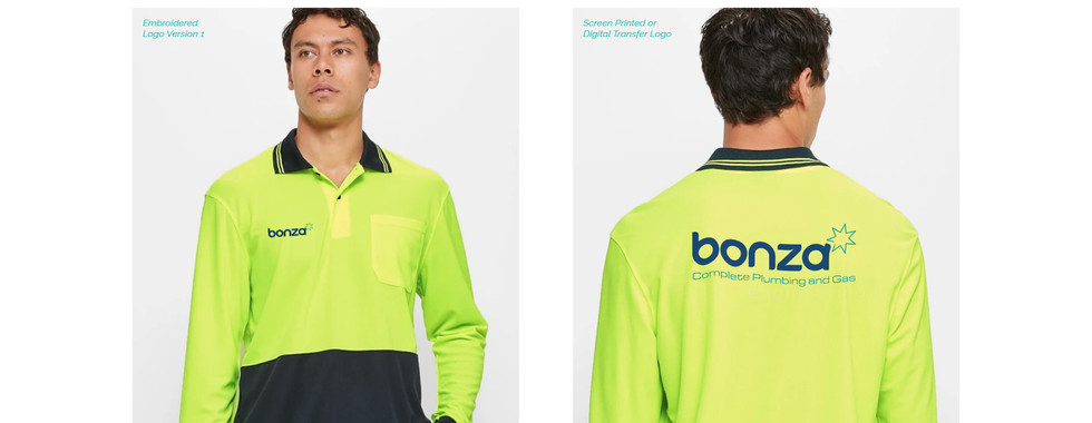
At first glance, the Bonza Complete Plumbing & Gas logo is clean and striking. But beneath its simplicity lies a deeply considered design that reflects the company's values, craftsmanship, and uniquely Australian spirit. Created to embody the ideals of precision, professionalism, and approachability, the Bonza brand is more than just a logo—it’s a visual story that speaks to the way Jared Salis and his team approach their work: doing it right the first time, every time.

The custom logotype for “Bonza” is based on a rounded san serif font but has been completely redrawn to create something distinct. The softened, rounded corners are not just stylistic—they’re symbolic. The letterforms echo the gentle curves found in copper and PVC piping, a subtle nod to the trade itself. Just like a well-laid plumbing system, the logo flows without kinks, interruptions, or awkward angles. It reflects the company's commitment to seamless work and its attention to detail, where nothing is out of place.
A Star with Meaning

At the heart of the Bonza logo is a seven-point star—an element rich with layered symbolism. It recalls the Federation Star on the Australian flag, proudly tying the brand to its roots. But there’s more: the star also mimics the spark of a piezo igniter, a common component in gas cooktops and hot water systems. This subtle detail hints at the company’s expertise not only in plumbing but also in gas services.
And of course, there's the name itself—Bonza, an Aussie term for something excellent or outstanding. The star visually reinforces this meaning, serving as a symbol of the “stellar” service Jared and his team strive to deliver on every job.
Colours with Character
The deep navy blue of the logo wasn’t chosen at random—it’s one of Jared’s personal favourites. It communicates dependability, professionalism, and integrity, reflecting the standard to which every Bonza job is held.
Within the star, a smooth gradient transitions from warm reds and oranges to cooler teals and blues. This colour blend captures Jared’s dual approach to business: warm and friendly in personality, yet cool-headed and reliable when solving problems. It’s a palette that speaks to both the human and technical sides of the company.
The Clean White Wordmark
The white logotype provides a crisp contrast against the deep blue background, bringing clarity and focus to the brand name. It also mirrors the clean finish of PVC piping—pristine, precise, and functional. This simple detail reinforces the company’s commitment to cleanliness and high standards in every project they take on.
From Brand to Website
The visual identity didn’t stop at the logo. The brand style guide was instrumental in shaping the design of the company’s website: bonzacompleteplumbing.com.au. The guide ensured that every visual element—from fonts and colours to imagery and layout—was aligned with the core values of the brand. The result is a digital presence that feels cohesive, trustworthy, and uniquely “Bonza,” echoing the same professionalism and warmth that clients experience in person.
The Bonza Complete Plumbing & Gas brand is a masterclass in thoughtful design. Every curve, colour, and symbol has been carefully chosen to reflect the company's values: excellence, reliability, and genuine care for the work they do. Just like a well-plumbed system, the design leaves no room for leaks, misalignments, or guesswork. It’s clean, considered, and built to last—just like Bonza’s work.


Comments